Tim Allen’s voice comes through your TV. A beautiful sunset appears over a lake. The Mackinac Bridge stands in all its glory. A skier flies down a hill of fresh powder. Tahquamenon Falls cascades into a rush of water. The Silver Lake Sand Dunes tower over two bodies of water. Lighthouses beam. Pure Michigan shines in all of its glory.
We are bombarded with ads every day. Whether on our tv or phone, consumers are constantly being flooded with the most recent products and trends. Consuming marketing has become commonplace in our world today. Pure Michigan ads never fail to captivate an audience, especially if you love Michigan. These ads ignite appreciation for the great state of Michigan.
It is a crazy concept that pieces of land must market themselves. But, tourism makes up a great deal of the American economy. So, it is very necessary for states to show what makes them special, and why someone should choose to visit. Instead of just waiting for the people to show up, states have decided to market themselves. Advertisers are creating personas for states to build their brand personality. They use slogans, catchphrases, traits, and commercials to connect people with the brand. It’s just like any other marketing plan.
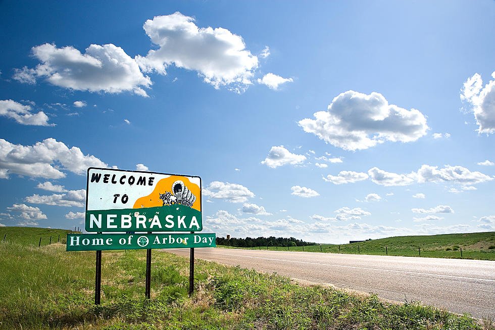
Michigan is known for being the Great Lakes State. Florida is known for being the Sunshine State. California is known for being the Golden State. All of these slogans paint a nice picture for consumers. Most states like to emphasize all the wonderful parts of them. However, Nebraska has taken a different approach to their marketing. In 2019, Nebraska released their new state slogan.
“Nebraska: honestly, it’s not for everyone.” Yes, you did read it correctly. No longer is Nebraska Nice or The Good Life. Nebraska’s Tourism Board Director said “the new ad campaign is honest, edgy, and something that Nebraska needed to increase tourism.”
Many Nebraskans were outraged and shocked by their new state slogan. I heard about Nebraska’s bold choice from a Nebraskan themselves, and they couldn’t help but laugh while talking about it. But, there’s the key. People were talking about it.
Advertisements come in all shapes, colors, and sizes. Meaning they’re all different and have a different approach to them. Nebraska wanted to get people talking about them again. A campaign about all things Nebraska including the invention of Kool-Aid, Warren Buffet’s house, and Runza were not going to cut it. So they took a bold route, and people started talking.
Not all advertisements are going to spark a joyous response. Sometimes ads are met with angry tweets or people mad at the state of Nebraska. But, there’s nothing bad about getting a response. A bad reaction is still a reaction. There are hundreds of ads that went wrong and people didn’t like, whether the brand expected it or not.
- Starbucks: “Collapse into Cool”

In 2002, Starbucks released an ad of two drinks sitting in a field of green grass made out of straws. The slogan at the top of the poster said “Collapse into Cool.” The poster was hit with a considerable amount of disgust because of the recent 9/11 attack. Between the imagery and the use of the word collapse, many citizens were outraged at Starbucks. After many hateful messages, and boycotts of the coffee giant, Starbucks pulled the ads. However, they released a statement explaining the real meaning of the ad. Although people were angry, there were also many people who defended Starbucks because they believed insensitivity had reached a peak if two tall objects could not be placed next to each other for the rest of eternity.
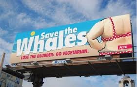
- PETA: “Save the Whales”

This billboard in Jacksonville, FL did go over well with many consumers. Even after replacing the billboard, PETA defended the original ad saying it encouraged many people to take on a vegetarian challenge. “Ever since placing our original ad, which showed a woman whose “blubber” was spilling out of her swimsuit, we’ve been inundated with calls and e-mails of support from people who want to take our 30-day Pledge to be Veg.” Their defense followed with a few facts about how a vegetarian diet can help you lose weight. However, the ad greatly offended many people, and I don’t think it was worth one mom claiming she would now go vegetarian.
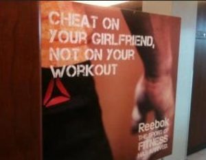
- Reebok: “Cheat on Your Girlfriend”

Apparently working out is more important than being loyal in a relationship? According to Reebok, that’s the rule to live by. Not much explaining needs to be done about this ad. People were undoubtedly upset about the message the brand was sending. Reebok removed the ads and issued a formal apology.
This is the world of advertising. You are not going to please everyone. You are not going to appeal to everyone. Nebraskans might get upset every once in a while. The difference between Nebraska’s new slogan and the three ads above is that Nebraska isn’t apologizing. They were looking for reactions with their new campaign. So far it seems to be working. Sure, Nebraska might not have much to offer compared to California, Florida, or New York. But, now people in different states are reading about Nebraska’s new slogan. If that doesn’t encapsulate the power of advertising, I don’t know what does.
Advertising is only one part of the big picture of marketing. Marketing is the umbrella of how a company wants to raise awareness for their brand. This is where it all starts. The marketing plan needs to establish the tone and message the company wants to be. Nebraska clearly wanted to send an edgy message because they aren’t apologizing for the slogan switch up. However, I’m not convinced Reebok’s marketing plan suggested they should be the company that encourages cheating. However, their advertisement sent that message. A marketing plan is a guide for all things promotion when it comes to a brand. When a strong marketing plan is set into place, the advertising will follow in line with the overall brand message. Ads created for a brand or company should be in line with the marketing plan, and if they’re not you may need to go back to the drawing board.

